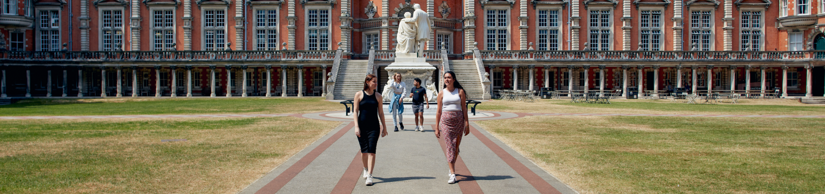
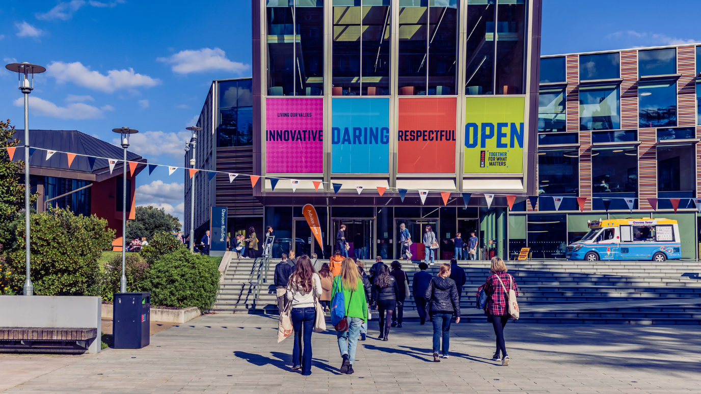
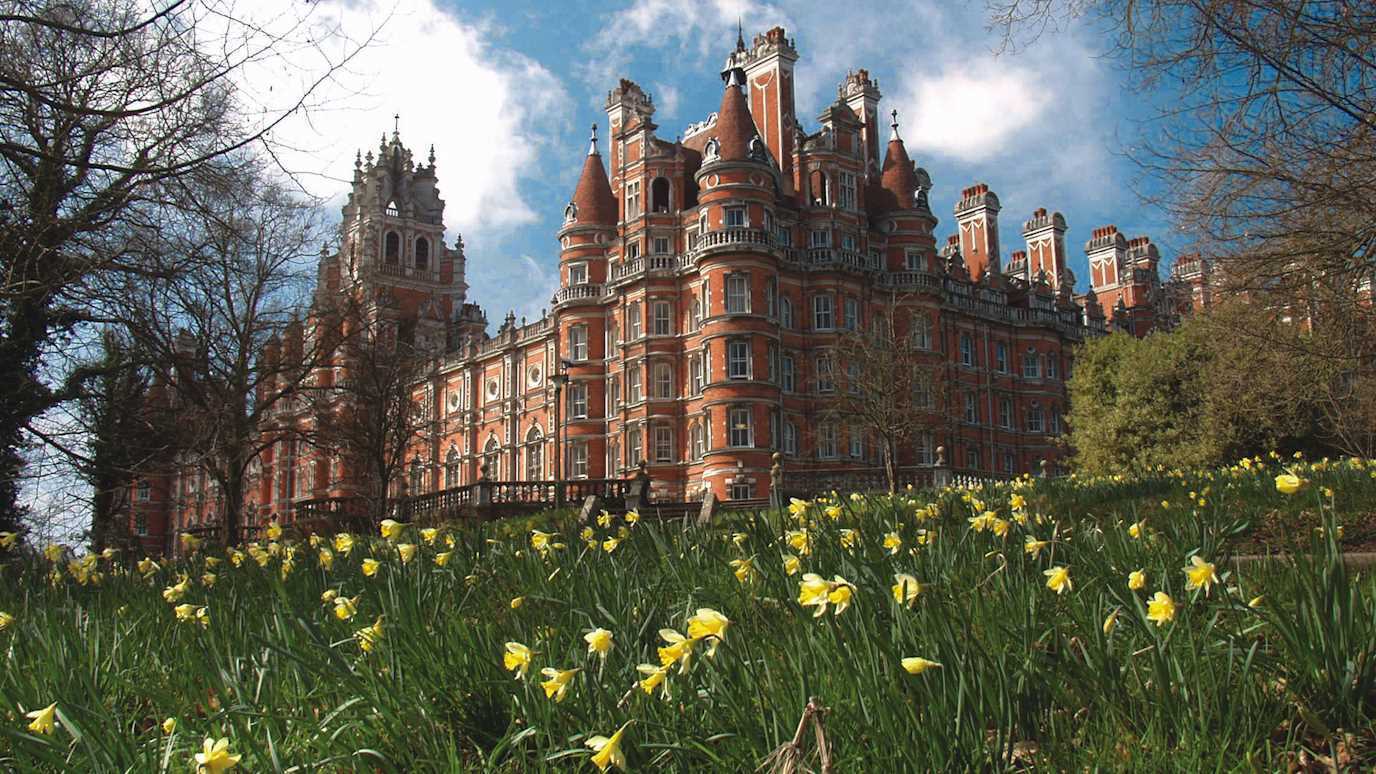


From the unmistakable orange of our Founder’s Building to the vivid greens of the surrounding woodland and cool tones of the city and beyond, our palette reflects and enhances our place in the world.
We are known for our bold orange colour, which reflects the bricks of the Founder’s Building, and helps us to stand out against competitors.
Our wider palette complements and enhances the power of our core colours, whilst giving greater flexibility and appeal to our audiences.
Primary palette
C0 M70 Y100 K0
R235 G100 B30
#eb641e
C65 M43 Y26 K78
R32 G42 B48
#202a30
C0 M7 Y15 K0
R255 G241 B223
#fff1df
C34 M17 Y15 K0
R180 G196 B208
#b4c4d0
Secondary palette
C0 M65 Y0 K0
R241 G124 B176
#f17cb0
C85 M52 Y0 K0
R10 G110 B196
#0a6ec4
C62 M0 Y6 K0
R31 G215 B250
#1fd7fa
C30 M28 Y0 K0
R189 G187 B255
#bdbbff
C75 M0 Y60 K0
R0 G181 B133
#00b585
C30 M0 Y90 K0
R204 G237 B43
#cced2b
Colour accessibility and combinations
Our palette has been developed for web to ensure black type meets a minimum of (WCAG) 2 Level AA Conformance on all colour values.
Text should primarily be set in black when used on top of any of our secondary colours. Shown above are the six accessible colour combinations which can be used in certain applications, such as on merchandise or secondary print layouts.
To ensure legibility for people with different forms of colour blindness, is particularly important to consider which colours should sit next to each other on tables and graphs.
To achieve this accessibility, text needs to be designed at a minimum size. Please see full guidelines for more information.
Colour applications
Our colour palette has been designed to flex across different applications and audiences.
Formal documents should use a more pared-back palette and lead with our primary colours.
As audiences become more familiar with us over time, we can begin to introduce colours from our secondary palette, different colour combinations with our patterns.